
The Positives
The Negatives
Enhancements can focus on increasing transparency in search results, providing clear account management, and addressing access issues to foster an engaged reading community
Real-time updates on resource availability can optimize the user experience, reducing ineffective searches.
Additionally, clarifying distinctions from traditional library lending will manage user expectations, and addressing the retry mechanism for invalid library card entries with troubleshooting guidance can effectively prevent account access issues.

User Flow
The flow chart depicts the user journey from sign-up to borrowing, mapping out the entire process.
Navigating Libby is a mostly seamless journey designed for accessibility and convenience. Libby's intuitive flow guides users through search queries, assesses the real-time availability of reading materials, and facilitates quick borrowing for an enjoyable literary exploration.
At the core of the platform's framework is the mandatory account creation, facilitating personalized interactions. Once set up, the app seamlessly navigates users through genre browsing, curated collections exploration, and personalized recommendations discovery.
Notably, the integration of a waitlist feature for high-demand titles enhances user engagement by allowing them to reserve spots.
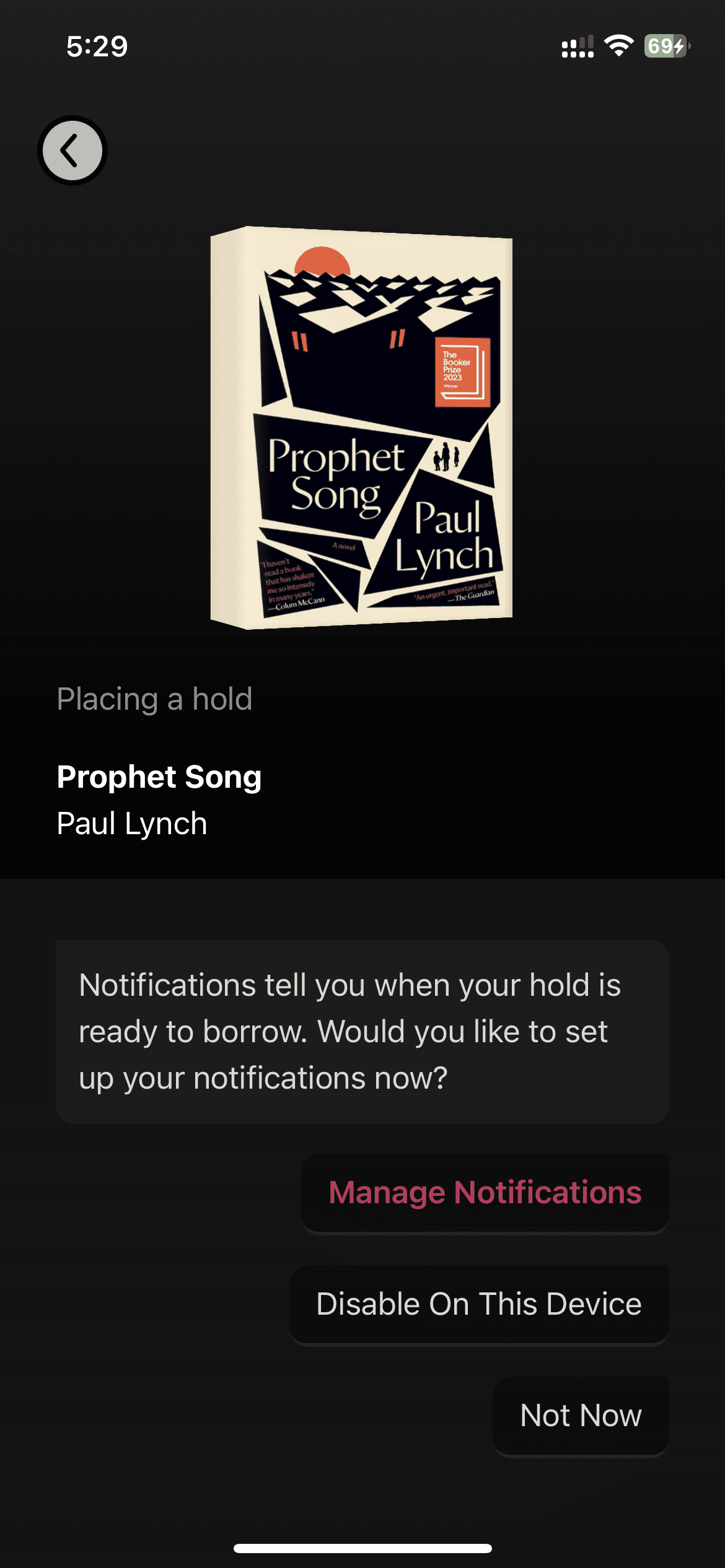
The app's intelligent system ensures timely notifications, keeping users informed about their position in book availability queues.


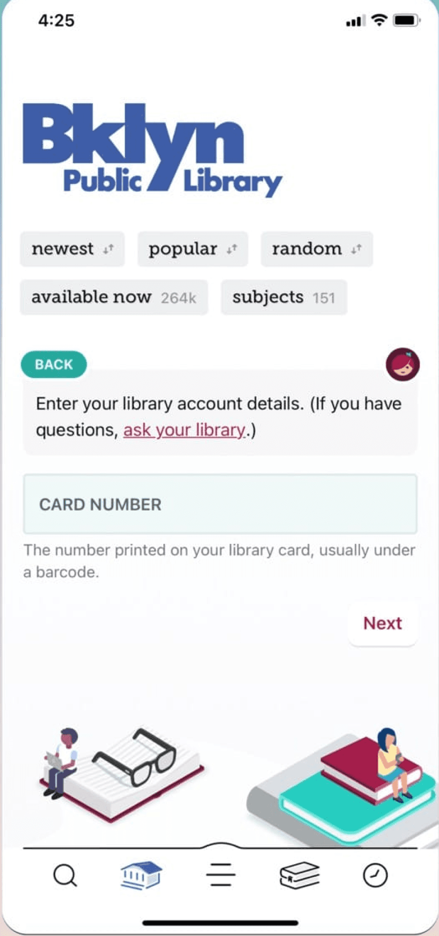
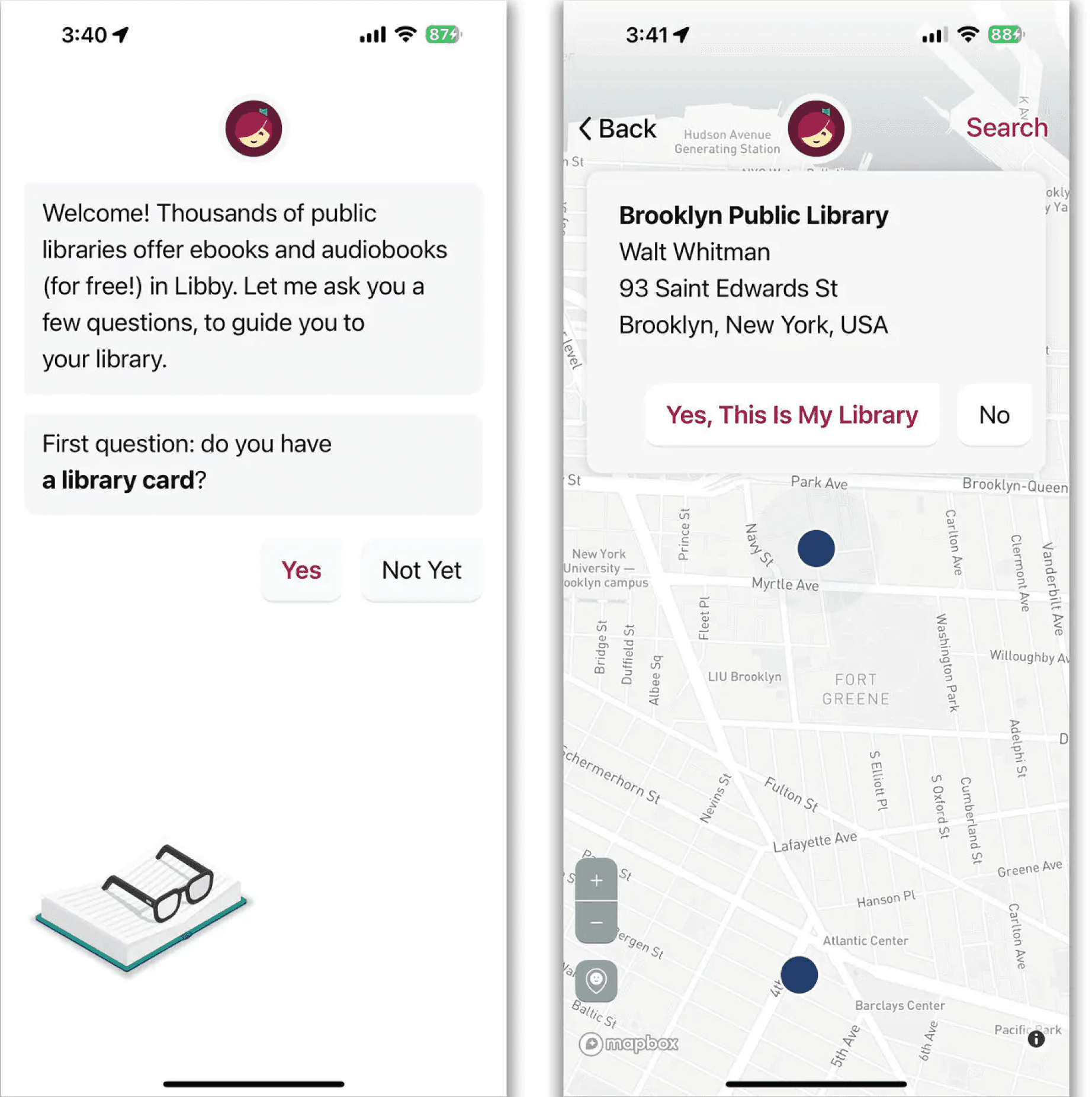
The sign-up process allows users to pick a library and add their card details to activate their accounts. This process is interestingly done through a chat box interface which is new and interactive. Which makes it easy to navigate through the activation steps.


Libby’s existing framework ensures smooth user journeys. However, there are noteworthy areas for enhancement.
References:
Libby Icon: OverDrive, Inc. (2023). Libby [Mobile application software]. Libby, by OverDrive. https://meet.libbyapp.com/
All other images taken from Unsplash
Illustrations: "Free illustrations from Streamline."
Navigation
Features
Interface

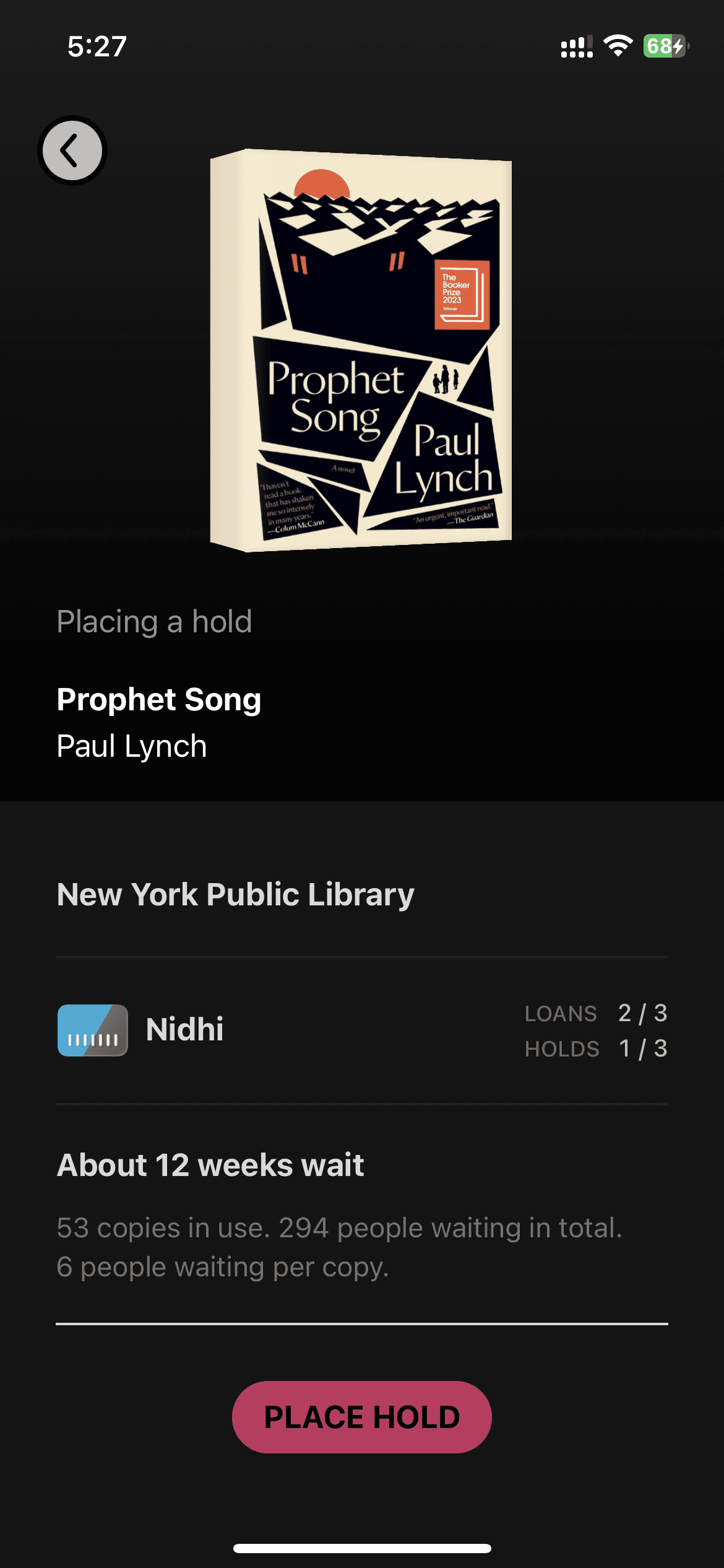
Placing hold and the waitlist notification Interface.
The clarity in the wait time is vocalized effectively to convey to the user the exact number of copies available, the number of people currently waiting and the statistics on how many people have placed a hold on a singular copy.