

Designed & Developed by XP DESIGN
An interface evaluation
E-reader & Audiobook Interface
What’s the Difference Between an Audio and E-book?
Audiobook Interface on Libby
Audiobook: A voice recording of a book being read aloud
E-Book: A book in electronic form, usually accessible through phones, tablets, computers, and other E-readers such as Kindles

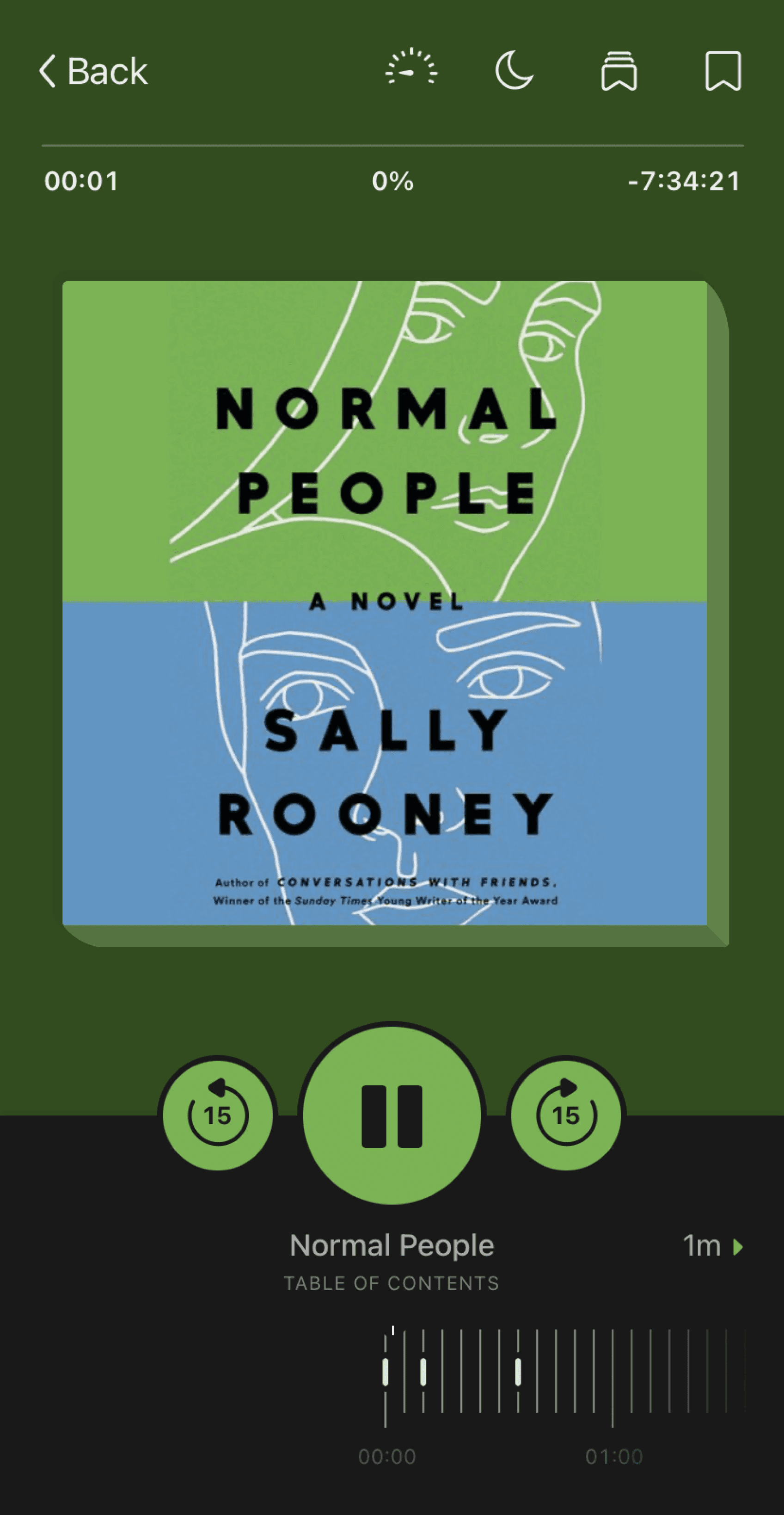
The audio-book interface is mostly intuitive and easy to use. The color palette adjusts to the cover of the book you’re reading, which is a nice touch. Here's a list of the features included:
• Pause/Play button
• Fast forward/reverse 15 seconds
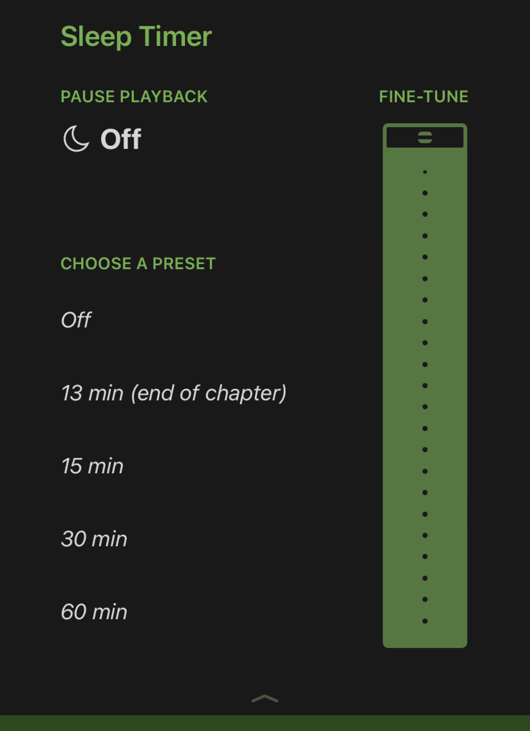
• Adjustable playback speed from .60x to 3.00x, adjusted with a fine-tune feature to adjust it.
• A percent (%) symbol to show how far you’re into tho book, and how much you have left
• A sleep timer that allows listeners to set the amount of time they’d like the audio to continue playing. They have a fine-tune feature to adjust it down to the minute.
• Bookmarks so users can add notes and annotations to specific text
• Bookmark highlights so users can access the bookmarks they’ve made here.
E-book Interface on Libby
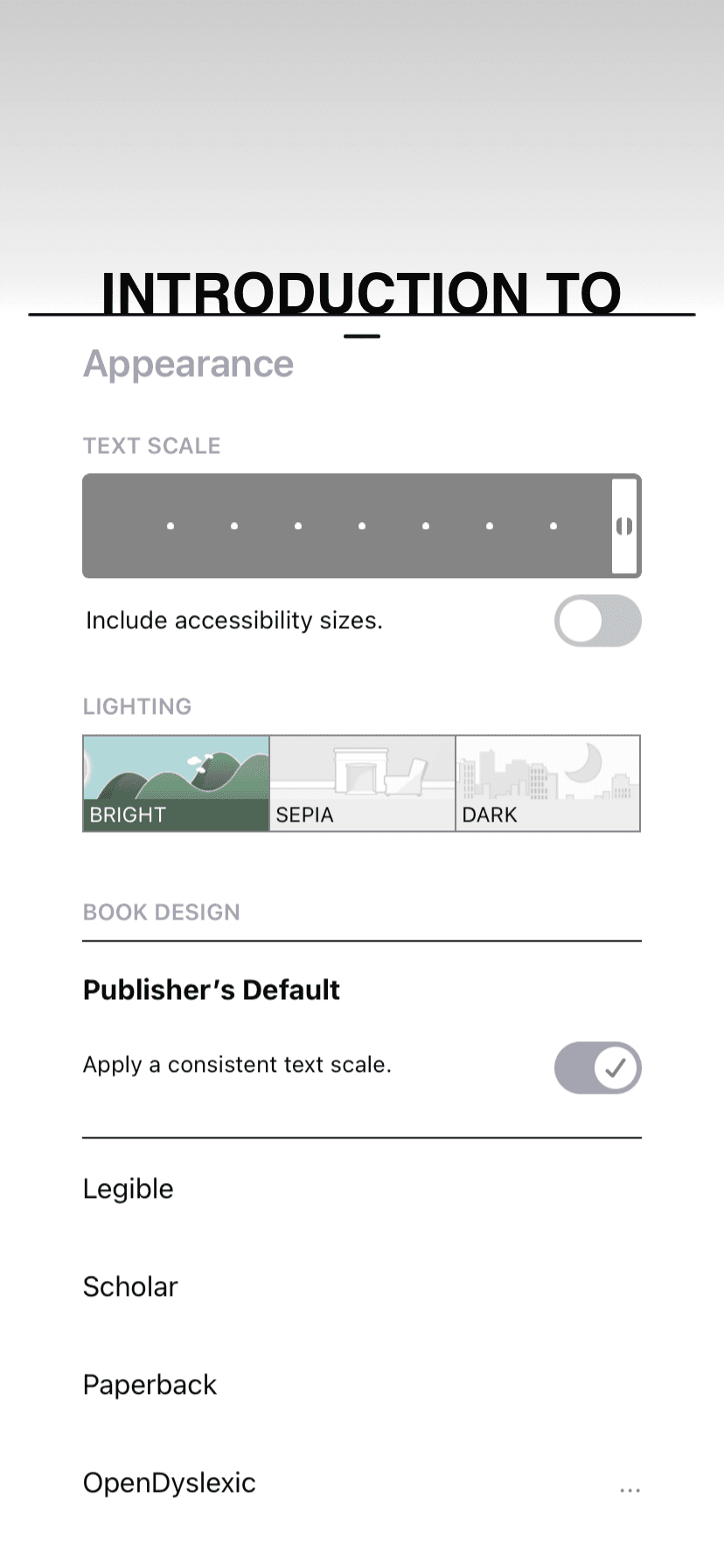
The e-book interface is easy to use, and has nice features that allow for customization while reading. These features include:
Adjustable color modes: Libby offers three color modes for users including a dark tone (Dark), a light tone (Bright), and a warm tone (Sepia)
Adjustable text size: Users are able to adjust the size of their text by accessing the “A” symbol on the top of the app. By switching “Include accessibility sizes”, users obtain an even larger range of sizes.
Adjustable book designs: “Legible,” “Scholar,” “Paperback,” and “OpenDyslexic”. These adjust the font style of the text.
Text annotation: Users can annotate text by pressing on the screen to highlight, and obtain definitions of words this way as well
Bookmark highlights: Users can access the bookmarks they’ve made here.
It’s unclear how to exit the drop down menu for the top features. There is a a gray arrow located at the bottom of the menu, but the contrast is poor and its purpose is unclear.
Here are our suggestions for improvement:
Increase the contrast between the background and the arrow to increase its discoverability.
OR
Eliminate the arrow entirely, and instead add an exit button at the top left or right of the screen.
Areas for Improvement
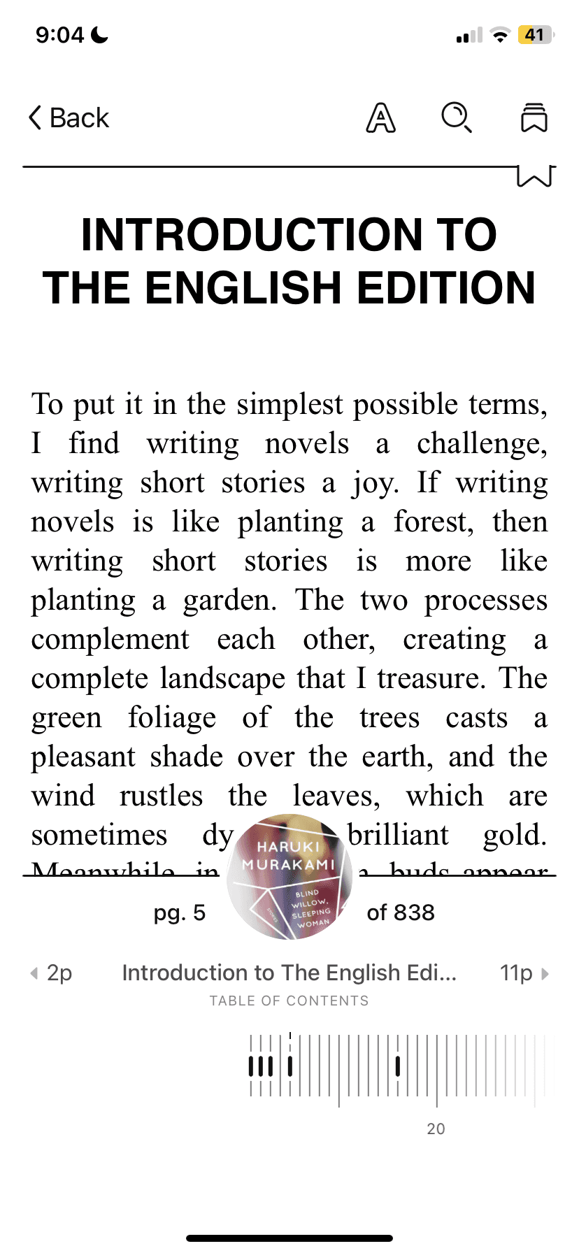
Once users begin reading and the navigation bar on top and the page numbers on the bottom disappear, it’s very unclear what input is required to bring them back. To fix this we suggest:
Providing instruction on what gesture is required to access this menu when first opening an ebook. This can take the form of a pop-up notification.
Right now, the gesture required to bring back these menus is holding two fingers down on the screen. This feels unintuitive. Instead, I think a swipe-up feature is better suited for this action.
Areas for Improvement
References:
Libby Icon: OverDrive, Inc. (2023). Libby [Mobile application software]. Libby, by OverDrive. https://meet.libbyapp.com/
All other images taken from Unsplash
Illustrations: "Free illustrations from Streamline."
Navigation
Features
Interface