Libby.

Designed & Developed by XP DESIGN
A look at the visual language of the Libby application.
App Interface
The primary font in use throughout the Libby app is Museo Slab.
This is the icon style used by the Libby app. We see the icons in use on the Nav Bar. It's a nice looking set of icons, albeit slightly inconsistent.
The Library and Shelf icons have depth, but the others remain flat.
The logic behind this is that these are two key features on the app and they are supposed to indicate the library, and your bookshelf at home.
This works for me since it goes towards building stronger brand recognition if they continue to own these two sections of the app in the future.
On thing that might confuse users is the Library icon, which could be confused with a home button.
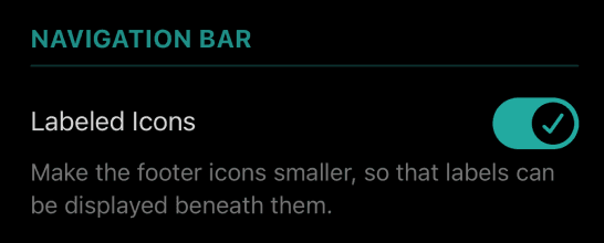
They also have an option to change the style of navigation bar. The three options are:
• Navigation bar icons with labels
• Icons without the labels
• No navigation bar icons
These are not options an app really needs to give its users. The rationale behind this would be to give users more options to customize their apps.
The third option with no nav bar is an experimental feature they are exploring. This brings the logo to the bottom (within reach of your thumb) and the app menu is nested within the Libby logo.
The color palette of the Libby app does a great job at making the application feel youthful and pleasing to use. It is a great move towards bring in a younger audience to the app.
It is a great step forward for the company as they discontinue their legacy OverDrive app and move to this fresher color story that will likely make it a pleasing experience for all users.
Of their brand colors, they use teal frequently throughout the app.
It is used judicially for some visual elements, buttons, indicating hover states and on headers.
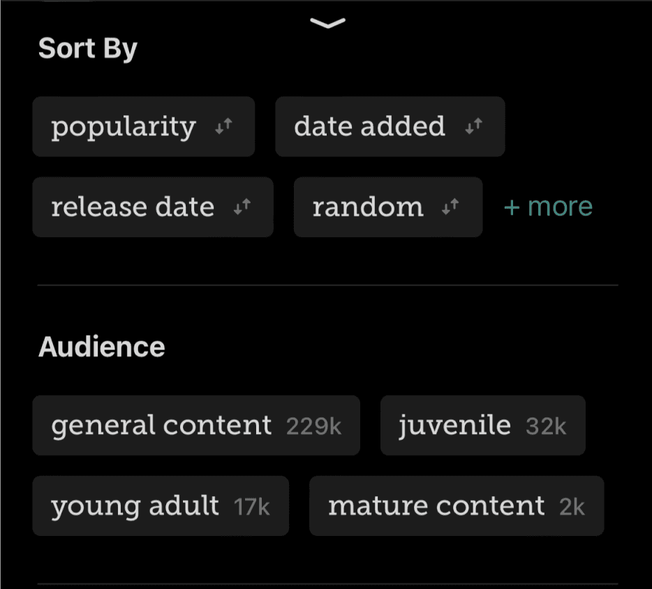
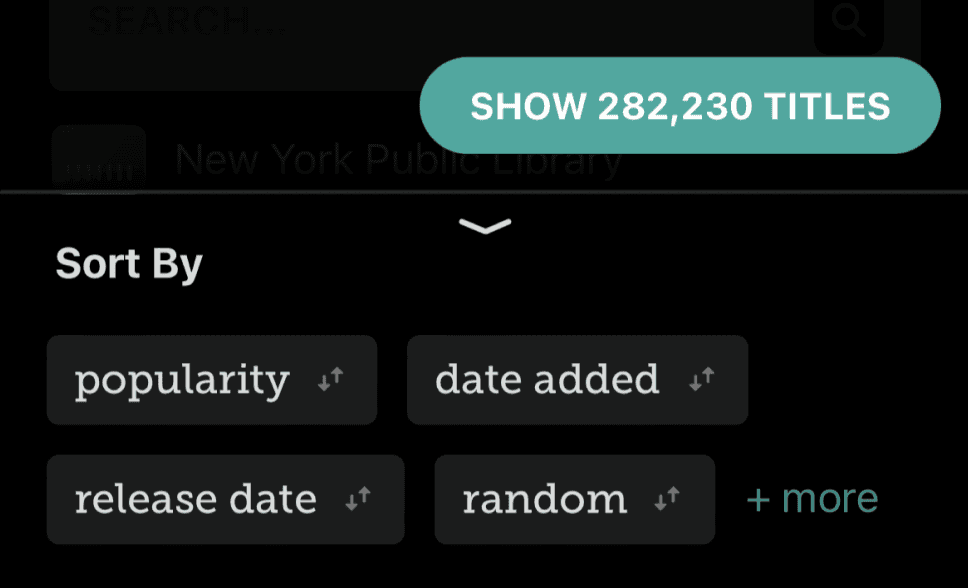
Slab serif fonts are a bolder alternative to serifs or sans serifs. This font selection again shows their conscious move towards making their app relevant to the design expectations of today and also make the app attractive for a younger audience. They use this font judicially throughout the app in places like headers, pill tags, and subheaders.
What I would like to see is greater consistency in the logic behind why this header font is used in some places and a stricter adherence to a set design system.
A B C D E F G H I J K L M N O P Q R S T U V W X Y Z
1 2 3 4 5 6 7 8 9 0
A B C D E F G H I J K L M N O P Q R S T U V W X Y Z
The Wordmark
The Colors
Typography
Iconography
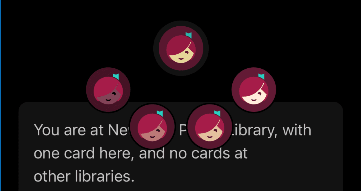
The Libby logo is supposed to be a librarian. It works really well, and captures the idea of a librarian quite well.
In an attempt to make their app more inclusive, Libby has alternate logo options that allow you to choose the the librarian’s skin tone. This is a fun feature they’ve added, but it does play on the stereotype that librarians are women.

No navigation bar icons
Without icon labels
With icon labels


References:
Libby Icon: OverDrive, Inc. (2023). Libby [Mobile application software]. Libby, by OverDrive. https://meet.libbyapp.com/
All other images taken from Unsplash
Illustrations: "Free illustrations from Streamline."
Navigation
Features
Interface