
Accessibility
A description and evaluation of Libby’s accessibility features & settings
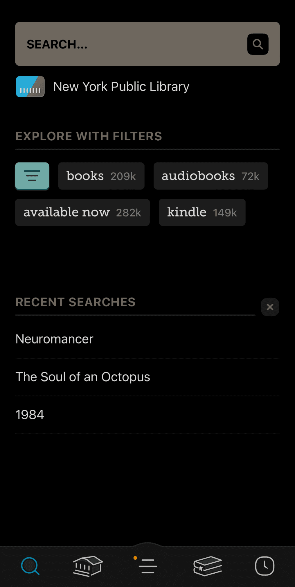
Libby has robust accessibility features, but the navigation to access them is a bit strange. The icons used on the navigation bar (like a building, clock, and stack of books) are unique to Libby so their meaning is not intuitive.
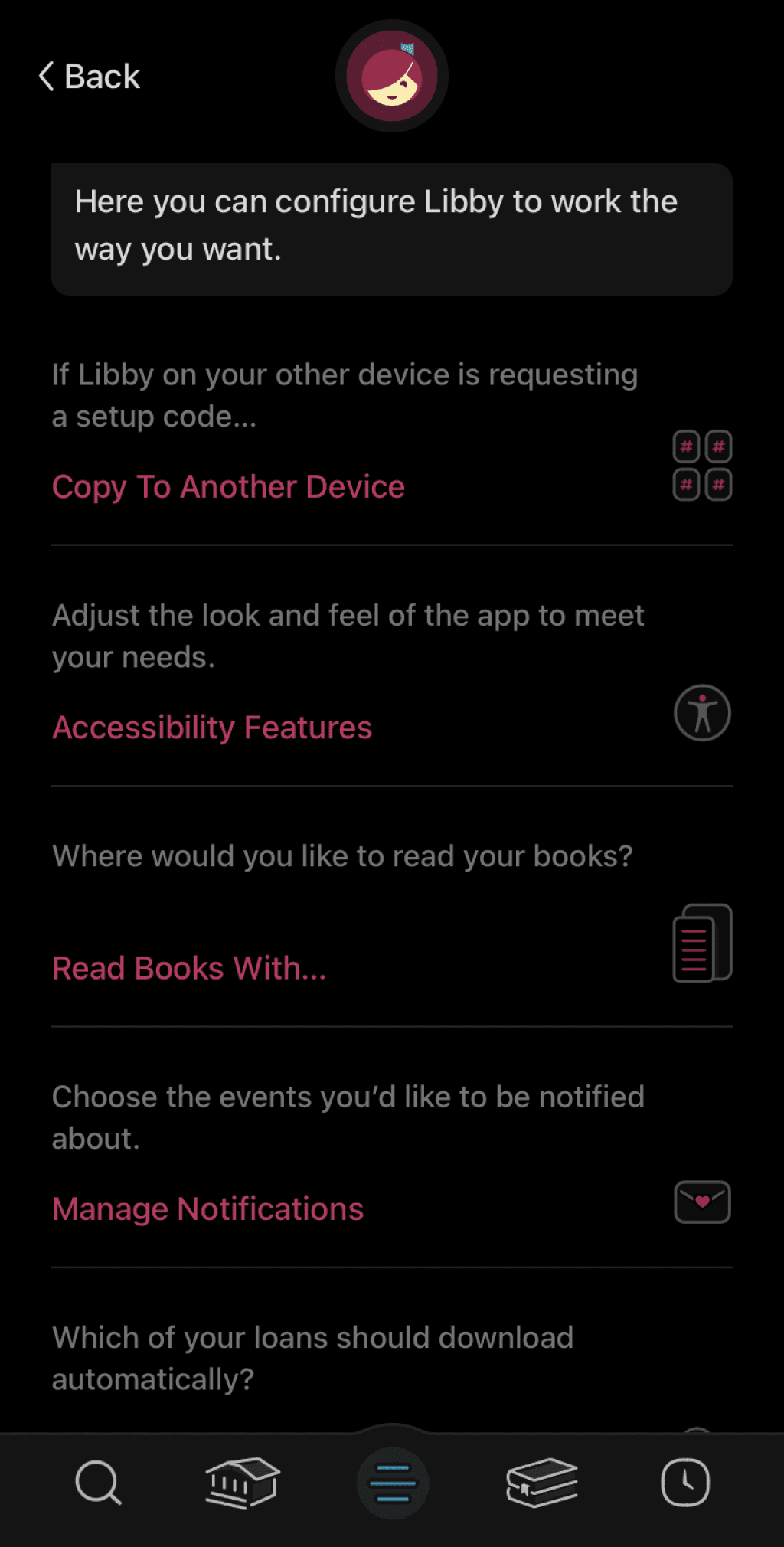
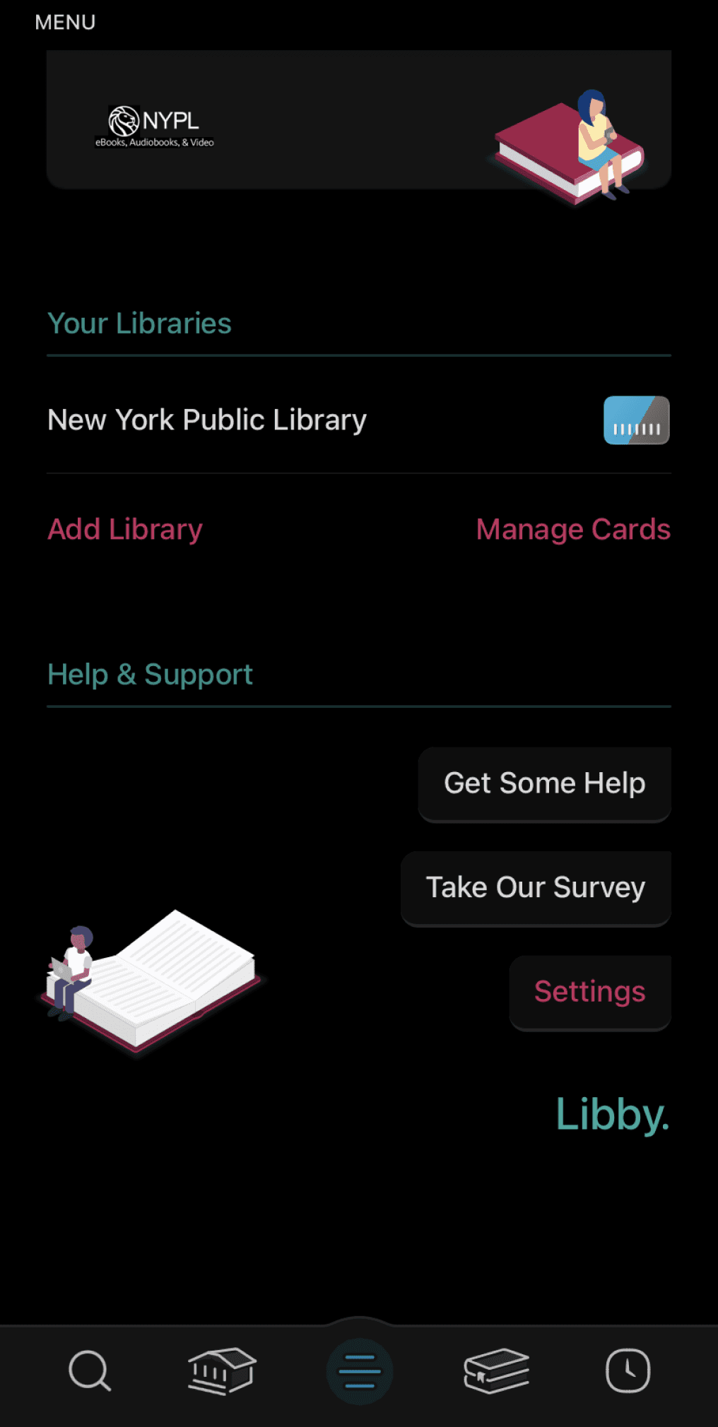
To access these accessibility features, you follow these steps:
Press the “Hamburger” icon, which is the middle button on the navigation bar, located at the bottom of the screen.
Press on the button labeled “Settings” on the following screen.
Select the heading labeled “Accessibility Features”.

Accessing Your Settings
What Accessibility Features Does Libby Offer?


• Screen reader compatibility: Screen readers are helpful to visually impaired users, as they read the platforms text aloud to assist in navigation.
• Reduce vibration: Eliminates the touch based feedback interactions.
• Adjustable playback speed for audiobooks: This allows users to adjust their listening speed to a level that is comprehensible to them. Allows the audio to be both sped up, and slowed down.
• Reduce text variation: This makes the in app text appear more uniform (ie. less bold or italicized text, text is presented in similar sizes)
• Adjustable playback speed for audiobooks: This allows users to adjust their listening speed to a level that is comprehensible to them. Allows the audio to be both sped up, and slowed down.
• Reduce motion: This will reduce the motion animations that appear across transition screens. This can help minimize users feeling overstimulated, and also reduce the load on the app to run.
• Adjustable text size: Adjustable text allows users to enlarge and minimize text as they see fit and to suit their reading needs. This is great for those who are visually impaired, or for anyone who experiences eye strain.
• Orientation locking: Users can use this to prevent their screen from shifting based on their movement.
• Keyboard shortcuts: Keyboard short cuts make browsing more efficient.
• Reduce color variation: This minimizes the color variation across the app, and works well for people who are color blind or have other visual impairments.
• Adjustable lighting for ebooks: Libby offers three different lighting settings to suit users use contexts. They are labeled as "bright", "sepia", and "dark". This helps to address eye strain, and also helps users adjust their experience to fit the lighting in their environment.
• Adjustable font for e-readers: Includes options titled “Legible”, “Scholar”, “Paperback”, and “OpenDyslexic”. OpenDyslexic offers more generous line spacing to increase readability for users who are dyslexic.
Areas for Improvement
The icons utilized within Libby's navigation bar are unclear and do not adhere to industry standards.
The "Shelf" tab is represented by two books stacked atop each other.
The main page feed is represented by an icon of a library building.
These icons are unintuitive and can replaced to better match what users are accustomed to. The following are my suggestions:
Make the main page be represented by the "Home" icon, instead of a library building.
Make the shelf tab represented by the "Bookmarks" icon.
Accessing the settings is confusing and they are difficult to find.
The settings feature is hidden in the "Hamburger" icon. This is an issue since this is where the accessibility customizations are found, and they should be more readily available to users who need them. This is our suggestion:
Make the settings be represented by the gear icon, and make them located in the top right of every screen.
Why do Accessibility Features Matter?
Accessibility features exist to make platforms and content usable for people with motor and cognitive disabilities. However, these settings can go on to benefit all populations.
Think of the ramps located by crosswalks in sidewalks. Those were originally created for wheelchair accessibility, but I'm sure you used one before while walking or riding a bike. Good accessibility works to improve your platform's usability, and broaden your user base to include more diverse populations.


References:
Libby Icon: OverDrive, Inc. (2023). Libby [Mobile application software]. Libby, by OverDrive. https://meet.libbyapp.com/
All other images taken from Unsplash
Illustrations: "Free illustrations from Streamline."
Navigation
Features
Interface